We got some great news on the bushfire zoning requirements from Eric recently... They introduced a lot of new rules after the horrible fires in 2009 which we thought might cause us problems. It turns out it will be a bit restrictive but nowhere as bad as we feared.
Here's Eric's notes:
According to the site diagram that you sent, the bushfire attack level would be 12.5 which is pretty easy to manage. I can itemize compliance issues with a table on the "general notes" page.
Most of the items can be covered with simple detailing. Several will require a bit more thought.
Cladding needs to be either:
- 6mm cement sheet, or
- a timber species listed in appendix E1 which includes Silvertop Ash that I often use.
http://www.radialtimbers.com.au/zproducts.htm
Windows that are less than 400mm from ground or deck level need to have toughened glass. Also they need to have either:
- bushfire shutters, or
- metal window/door frames, or
- timber frames made with wood from table E2.
You may need to check timber species from window suppliers, or else use the hybrid metal outside and timber inside windows.
Miglas does a nice window, and the timber species might comply. They don't do traditional double hung windows, though. http://www.miglas.com.au/top/home/
Decking needs to be either:
- non-combustable
- a timber species listed in appendix E1 which includes Silvertop Ash
In a nut shell, it all looks manageable to me without any drastic changes. You might need a few slightly more "modern" finishes than we've been thinking of, but not many.
Showing posts with label newhouse. Show all posts
Showing posts with label newhouse. Show all posts
Tuesday, September 15, 2009

Friday, April 03, 2009
marking out the new house
On our first day, we were met at the block by Sam and John. Fuelled with celebratory champagne they brought along, we proceeded to spraypaint out the layout of the new house. (Not that we planned to do any excavation work this trip, but so that we had it as reference for working out the location of other things)
Needless to say, it was an entertaining job. :-)

Needless to say, it was an entertaining job. :-)
Tuesday, February 10, 2009
Engineering plans are done - woohoo!
After the planning permit for the new house was approved in September, we decided to bite the bullet and get the Structural Engineering Plans drawn up.
We had originally planned to use someone local in Maryborough, but they seemed reluctant to take on any new work. So, after several failed attempts at getting them to engage, we gave up and found someone in Melbourne instead.
The firm who helped us out were recommended by Eric, our architect, and they turned out to be great. Not only did they get the work done pretty much on deadline, compared to other quotes we had they were very reasonable too. So, if you're looking for a structural engineer in Victoria, I recommend them: John Gardner & Associates.
You can see the plans below. (I warn you it is *scintillating* reading - NOT).
PART 1: S1 to S6
8093 - S1 to S6
PART 2: S7 to S12
8093 - S7 to S12
And if that wasn't enough... there is PART 3: 73 whole pages full of computations.
We had originally planned to use someone local in Maryborough, but they seemed reluctant to take on any new work. So, after several failed attempts at getting them to engage, we gave up and found someone in Melbourne instead.
The firm who helped us out were recommended by Eric, our architect, and they turned out to be great. Not only did they get the work done pretty much on deadline, compared to other quotes we had they were very reasonable too. So, if you're looking for a structural engineer in Victoria, I recommend them: John Gardner & Associates.
You can see the plans below. (I warn you it is *scintillating* reading - NOT).
PART 1: S1 to S6
8093 - S1 to S6
PART 2: S7 to S12
8093 - S7 to S12
And if that wasn't enough... there is PART 3: 73 whole pages full of computations.
Friday, January 02, 2009
inspiration from Sagamore Hill
We were just watching an American history documentary, when it showed a house: Sagamore Hill in Long Island, New York. It belonged to Teddy Roosevelt. It's a great house, but what struck me on sight was the colouring. We both really really liked it, to the extent that I'm wondering whether we should mimic the colours at Amherst.
Thanks to the wonders of Flickr here's some photos, showing it in different lights and seasons. (Thanks very much to those who took these photos and posted them in a form they could be blogged).

Sagamore Hill
Originally uploaded by cyclingbill2003

Sagamore Hill
Originally uploaded by halgil

360/366 Sagamore Hill
Originally uploaded by Amberture
The main house is coloured blue - of a similar albeit slightly lighter hue than the one we picked for the cottage. But what's different is that they've used a darker grey colour as accent for the window frames - whereas up till now I'd been planning to use an off-white.
I also really like how they've got the contrast with the rust red on some walls. That could work perhaps for the extension parts of the cottage - the upstairs bathroom part; the laundry - as well perhaps as the library extension on the main house? Need to think some more about this, but it has certainly given me some more ideas... Even if we didn't go with the red colour - the idea of having a sharp contrast - green perhaps? - is appealing.
Thanks to the wonders of Flickr here's some photos, showing it in different lights and seasons. (Thanks very much to those who took these photos and posted them in a form they could be blogged).
Sagamore Hill
Originally uploaded by cyclingbill2003
Sagamore Hill
Originally uploaded by halgil
360/366 Sagamore Hill
Originally uploaded by Amberture
The main house is coloured blue - of a similar albeit slightly lighter hue than the one we picked for the cottage. But what's different is that they've used a darker grey colour as accent for the window frames - whereas up till now I'd been planning to use an off-white.
I also really like how they've got the contrast with the rust red on some walls. That could work perhaps for the extension parts of the cottage - the upstairs bathroom part; the laundry - as well perhaps as the library extension on the main house? Need to think some more about this, but it has certainly given me some more ideas... Even if we didn't go with the red colour - the idea of having a sharp contrast - green perhaps? - is appealing.
Sunday, June 01, 2008
so it'll be a grey roof then
The only slight concern that we had with the last set of plans from Eric was that there are now 2 solar panels prominently displayed on the roof.
I was a little worried they might be an eyesore, so asked what flexibility there was to move and/or disguise.
Here's Eric's response:
For solar panels to work properly in this situations a few few criteria need to be addressed:
- North facing, minimal shading
- Nearby, and below the hot water tank (which is also positioned to suit the wood cooker)
- The pipe from the tank to the panel needs to go down continuously with no dips or uphill section.
I think that this is a good position for the system to work. Another option is on the east verandah roof, but it will be shaded by early afternoon. It can even go at ground level, but there is always a chance that the panels will be broken. One option to hide the panels is to have a grey roof which I often do.
So, it'll be a grey roof then. :-)
I was a little worried they might be an eyesore, so asked what flexibility there was to move and/or disguise.
Here's Eric's response:
For solar panels to work properly in this situations a few few criteria need to be addressed:
- North facing, minimal shading
- Nearby, and below the hot water tank (which is also positioned to suit the wood cooker)
- The pipe from the tank to the panel needs to go down continuously with no dips or uphill section.
I think that this is a good position for the system to work. Another option is on the east verandah roof, but it will be shaded by early afternoon. It can even go at ground level, but there is always a chance that the panels will be broken. One option to hide the panels is to have a grey roof which I often do.
So, it'll be a grey roof then. :-)
Thursday, May 29, 2008
detailed plans for new house (almost)
Today the almost-finished house plans arrived from Eric. I say almost, as there's still a chance they might need tweaking depending on the structural engineers report. (Which as yet we've not commissioned, as holding off to hear about the planning permit and also to get some alternative quotes).
These plans are designed to be of sufficient detail to be suitable for applying for a building permit. As much as he could, Eric has kept descriptions generic, to allow us flexibility in deciding on the precise brand / style of finish.
The best thing about this set of the plans is that it's got detailed measurements, so we can at last seriously cracking on working out things like the design of the kitchen.
I've uploaded a couple of the pages to Flickr as below, but if you're curious, the full set of plans (all 17 pages worth) is here.
Ground floor - main house:

Second floor - main house:
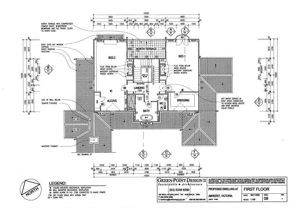
Library wing:
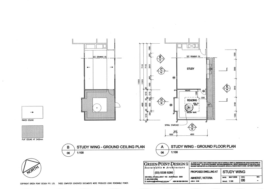
These plans are designed to be of sufficient detail to be suitable for applying for a building permit. As much as he could, Eric has kept descriptions generic, to allow us flexibility in deciding on the precise brand / style of finish.
The best thing about this set of the plans is that it's got detailed measurements, so we can at last seriously cracking on working out things like the design of the kitchen.
I've uploaded a couple of the pages to Flickr as below, but if you're curious, the full set of plans (all 17 pages worth) is here.
Ground floor - main house:
Second floor - main house:
Library wing:
Wednesday, May 07, 2008
Hot water system
We had to decide on the hot water system type for the new house, so Eric could factor it into the plans. He laid out two basic options, of which we decided to go with Option 1 - not least because we don't have mains gas connection:
Option 1:
"One that I have used successfully in projects like yours is a hybrid of solar, wood fire and electric with a tank concealed in the roof space. The electric element rarely gets used. We used this arrangement at our old bush block where we didn't have mains electricity, so the electric element was never connected. The system works well in summer (solar) and winter (wood fire). There are occasional warm overcast days (about ten per year, from my experience) when the fire is not on and the and clouds prevent solar heating. The seperate concealed tanks don't seem to come with gas boosters, only electric. You need a plumber who is familiar with these systems to make sure it works properly"
Option 2:
"A common arrangement these days is a solar 'pre-heater' with an LPG instant gas heater. The system comprises of a tank and solar panels mounted on the roof. Water circulates through the panels heating the water in the tank when there is sunshine. From the tank, the water passes through a 'instant' LPG heater before going to the tap. If the water is already hot (summer) the LPG heater doesn't come on. If the water is cool or just warm, the LPG heater goes on enough to top it up. These systems are very common and most plumbers could fit them"
Option 1:
"One that I have used successfully in projects like yours is a hybrid of solar, wood fire and electric with a tank concealed in the roof space. The electric element rarely gets used. We used this arrangement at our old bush block where we didn't have mains electricity, so the electric element was never connected. The system works well in summer (solar) and winter (wood fire). There are occasional warm overcast days (about ten per year, from my experience) when the fire is not on and the and clouds prevent solar heating. The seperate concealed tanks don't seem to come with gas boosters, only electric. You need a plumber who is familiar with these systems to make sure it works properly"
Option 2:
"A common arrangement these days is a solar 'pre-heater' with an LPG instant gas heater. The system comprises of a tank and solar panels mounted on the roof. Water circulates through the panels heating the water in the tank when there is sunshine. From the tank, the water passes through a 'instant' LPG heater before going to the tap. If the water is already hot (summer) the LPG heater doesn't come on. If the water is cool or just warm, the LPG heater goes on enough to top it up. These systems are very common and most plumbers could fit them"
Monday, May 05, 2008
the house model has landed
So I gave you a sneak preview of this a while back, but this week the real thing arrived!
It's had pride of place on the kitchen table but finally this weekend I got round to taking photos. Here's a montage of them complete with cheesy music. Enjoy! :-)
It's had pride of place on the kitchen table but finally this weekend I got round to taking photos. Here's a montage of them complete with cheesy music. Enjoy! :-)
Thursday, April 24, 2008
Our house in miniature
Ta da... The first sighting of the model for the new house which is currently winging its way across the oceans to us.
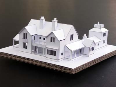
I'll take more photos from every angle when it arrives but couldn't resist sharing this sneak preview.
I love it. :-)
I'll take more photos from every angle when it arrives but couldn't resist sharing this sneak preview.
I love it. :-)
Sunday, April 13, 2008
latest floorplans for the new house
It's floorplans galore at the moment. Hot on the heels of *finally* getting the finished plans for the cottage, after nearly a year's hiatus we now have revised plans for the dream house being built next door.
Here's roughly how it all fits together, with the cottage and dream house - along hopefully with a shed for Dave - helping to create an almost fully enclosed "secret garden" area. We're doing up the cottage first to live in before starting on the dream house:
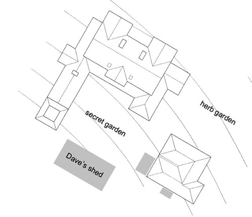
Now focusing on the dream house...
Here's the ground floor:
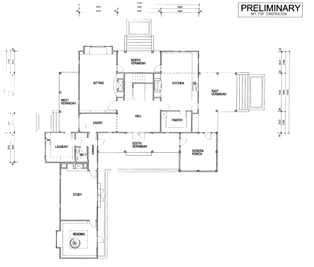
The Study will double as a Dining Room for big occasions like Christmas.
The Study/Reading room wing is now bigger and more clearly separated into rooms. We did this partly to get extra wall space for bookshelves, and partly to make it easier to convert to a bedroom, if God forbid we ever had to sell or found ourselves incapacitated and unable to sleep upstairs. I'm still not 100% certain on the placement of the doorway between the study and reading room though.
Here's the second floor:
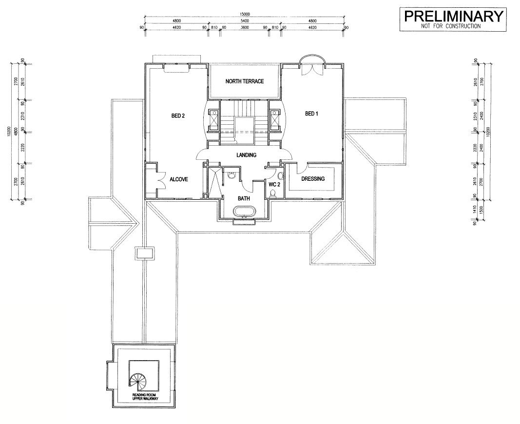
The dressing room is much bigger - it's now a proper room rather than a large walk in closet. It's also had the positive side effect of making the bathroom bigger too. :-)
In case you're wondering why only one bathroom and not ensuites... This was a deliberate choice. Should we ever have to sell, the configuration is such it would be easy to add/convert to ensuites. But, for us we didn't see the point in sacrificing space to multiple bathrooms that we'd never use.
The other major change is the addition of the front upstairs terrace that Pete suggested, accessible by climbing out the window. I want to make the windows with big sills so you can prop a cushion on them and sit half in the room, half out.
And of course, the upstairs storey of the reading room.
Finally, here's the various profile views:
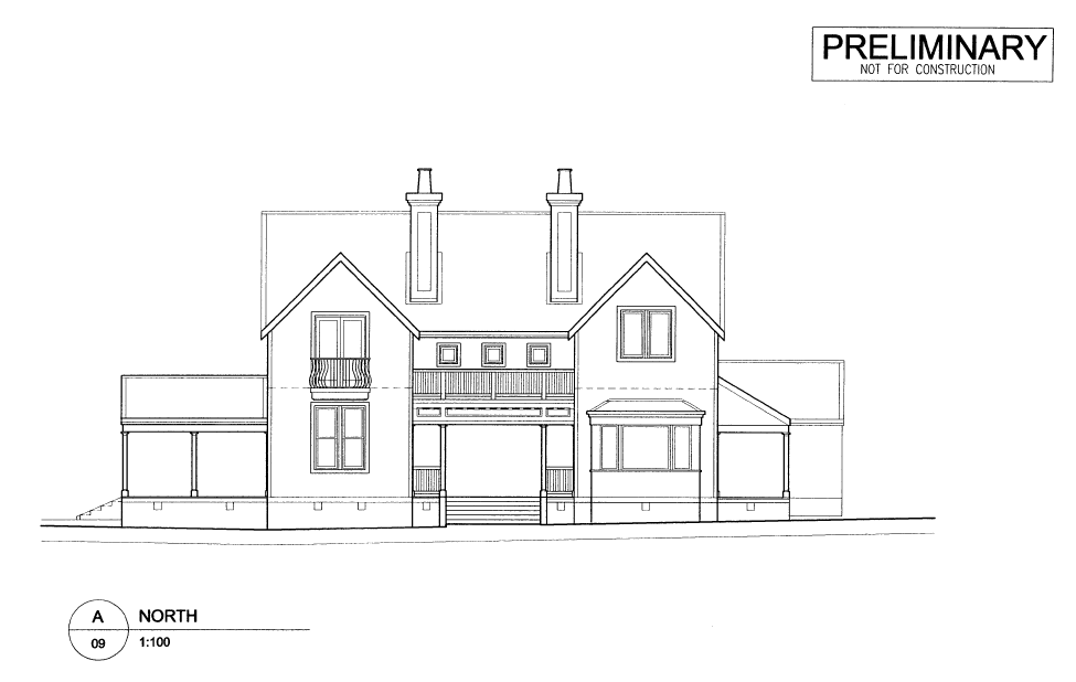
North: looking down the hill towards the dam and orchard:
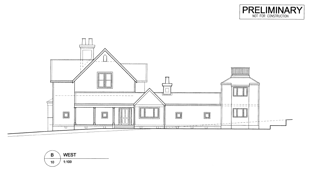
West: this is the view you'll see as you get to the end of the driveway, thus arguably this could be considered the "front". I love the way the profile looks now with the tower in.
South: this is the view from standing midway in the 'secret garden'. It's not complete because it doesn't have the tower shown, but you can imagine the shape. I love how the bath will be in the upstairs bay overlooking this.

East: there are two versions of this, first what you'd see from the outside:
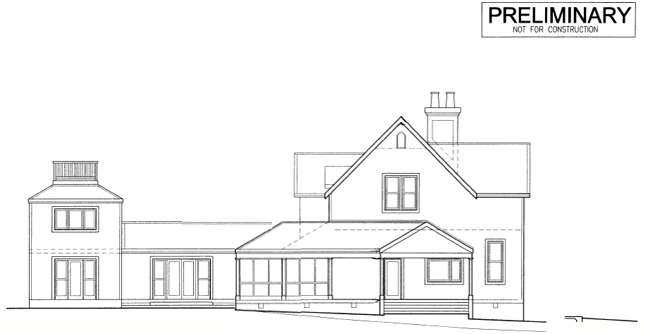
and second, a kind of cross section view of it:
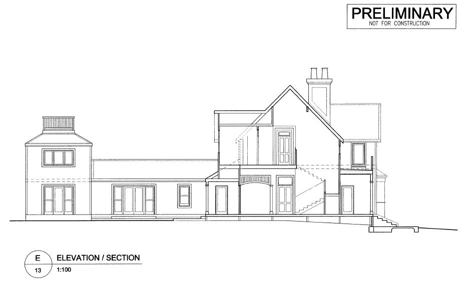
Here's roughly how it all fits together, with the cottage and dream house - along hopefully with a shed for Dave - helping to create an almost fully enclosed "secret garden" area. We're doing up the cottage first to live in before starting on the dream house:
Now focusing on the dream house...
Here's the ground floor:
The Study will double as a Dining Room for big occasions like Christmas.
The Study/Reading room wing is now bigger and more clearly separated into rooms. We did this partly to get extra wall space for bookshelves, and partly to make it easier to convert to a bedroom, if God forbid we ever had to sell or found ourselves incapacitated and unable to sleep upstairs. I'm still not 100% certain on the placement of the doorway between the study and reading room though.
Here's the second floor:
The dressing room is much bigger - it's now a proper room rather than a large walk in closet. It's also had the positive side effect of making the bathroom bigger too. :-)
In case you're wondering why only one bathroom and not ensuites... This was a deliberate choice. Should we ever have to sell, the configuration is such it would be easy to add/convert to ensuites. But, for us we didn't see the point in sacrificing space to multiple bathrooms that we'd never use.
The other major change is the addition of the front upstairs terrace that Pete suggested, accessible by climbing out the window. I want to make the windows with big sills so you can prop a cushion on them and sit half in the room, half out.
And of course, the upstairs storey of the reading room.
Finally, here's the various profile views:
North: looking down the hill towards the dam and orchard:
West: this is the view you'll see as you get to the end of the driveway, thus arguably this could be considered the "front". I love the way the profile looks now with the tower in.
South: this is the view from standing midway in the 'secret garden'. It's not complete because it doesn't have the tower shown, but you can imagine the shape. I love how the bath will be in the upstairs bay overlooking this.
East: there are two versions of this, first what you'd see from the outside:
and second, a kind of cross section view of it:
Saturday, November 10, 2007
redesigned library
Woohoo! Eric's sent through the first part of the redesign, and we love it.
From his email on November 7th:
I've been working through that list of modifications. Widening the hall and pantry was more difficult than I had imagined, but I have it working. It sounds simple, but I have designed the house to work on a simple structural module. That will help down the track with some of the details. Here are some sketches of the library tower and how it could work with some future bed rooms where the billiard table will go.
Here's the side view:
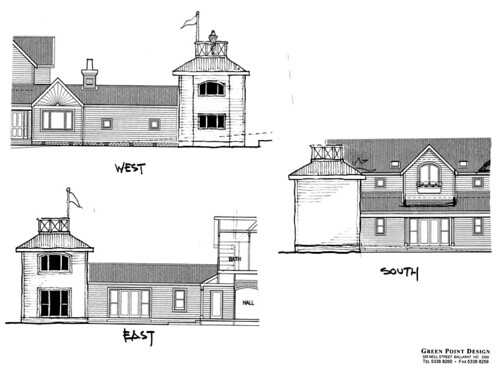
Here's the floorplan views:

Hopefully we'll never have to convert it to bedrooms, but so pleased we have the option. We could either put it to two small bedrooms as this shows, and convert part of the laundry to be a shared bathroom for them, or else put in just one lovely downstairs bedroom with ensuite.
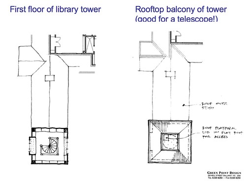
Finally, this shows the first floor and rooftop balcony for the library tower. Not much to say about this except that we love it. I know it's utterly whimsical and we'll probably use the tower balcony once in a blue moon, but it will be such fun to have and give a great looking over the houses and garden.
From his email on November 7th:
I've been working through that list of modifications. Widening the hall and pantry was more difficult than I had imagined, but I have it working. It sounds simple, but I have designed the house to work on a simple structural module. That will help down the track with some of the details. Here are some sketches of the library tower and how it could work with some future bed rooms where the billiard table will go.
Here's the side view:
Here's the floorplan views:
Hopefully we'll never have to convert it to bedrooms, but so pleased we have the option. We could either put it to two small bedrooms as this shows, and convert part of the laundry to be a shared bathroom for them, or else put in just one lovely downstairs bedroom with ensuite.
Finally, this shows the first floor and rooftop balcony for the library tower. Not much to say about this except that we love it. I know it's utterly whimsical and we'll probably use the tower balcony once in a blue moon, but it will be such fun to have and give a great looking over the houses and garden.
Wednesday, September 12, 2007
kickstart
The house design alterations have been on the backburner for months, as Eric had a bunch of other projects he needed to work on plus he moved house to Ballarat. We didn't mind as we're not in any rush, but it is a nice feeling to have finally got back to working on it. (For a reminder of where we left off, see here)
Eric kickstarted the process again with an email on September 11th:
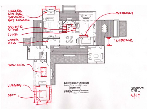
"Well, I finally started going through the plans again today. I have notes from our conversations from the last little while. I thought that since it has been so long (my fault) it would be prudent to mark up what I believe to be the areas to look at. These mark ups aren't necessarily the solution, but rather the general ideas. Can you have a look and tell me if it reflects the areas to look at?"
Ground floor:
Top floor:
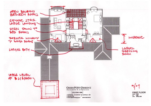
Side views:
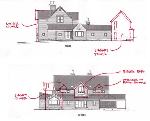
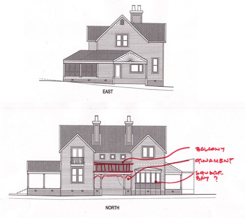
We replied a few days later:
"Thanks a lot for this. I just looked through the plans with Dave and what you have tallies with our recollections too.
We have just a couple of general thoughts re: the library tower... I really like the idea of having the bigger library. And Dave is thrilled about the idea of having his tower. :-)
Our only slight hesitation is in terms of what it potentially does to the house value, were we ever to have to sell it. Before, we could arguably pretend the library was another bedroom. Now it will be less easy... I'm wondering whether there's a way of having our cake and eating it too - ie: having a library extension but by playing with where the stairs are & shape of upstairs floor, making it so that the library billiards area + extension could be easily converted to ideally 2 other bedrooms if ever needed in future?
Also, Dave is curious to explore some other roof designs for the tower, eg: a squarer roof rather than triangular. He still wants it to be pointy though - ie: he's not thinking of it being a flat roof (even though perhaps it could be cool as a kind of mini lookout thingy)"
Eric kickstarted the process again with an email on September 11th:
"Well, I finally started going through the plans again today. I have notes from our conversations from the last little while. I thought that since it has been so long (my fault) it would be prudent to mark up what I believe to be the areas to look at. These mark ups aren't necessarily the solution, but rather the general ideas. Can you have a look and tell me if it reflects the areas to look at?"
Ground floor:
Top floor:
Side views:
We replied a few days later:
"Thanks a lot for this. I just looked through the plans with Dave and what you have tallies with our recollections too.
We have just a couple of general thoughts re: the library tower... I really like the idea of having the bigger library. And Dave is thrilled about the idea of having his tower. :-)
Our only slight hesitation is in terms of what it potentially does to the house value, were we ever to have to sell it. Before, we could arguably pretend the library was another bedroom. Now it will be less easy... I'm wondering whether there's a way of having our cake and eating it too - ie: having a library extension but by playing with where the stairs are & shape of upstairs floor, making it so that the library billiards area + extension could be easily converted to ideally 2 other bedrooms if ever needed in future?
Also, Dave is curious to explore some other roof designs for the tower, eg: a squarer roof rather than triangular. He still wants it to be pointy though - ie: he's not thinking of it being a flat roof (even though perhaps it could be cool as a kind of mini lookout thingy)"
Sunday, November 12, 2006
tweaks to new house plans
We're almost finished now on the plans for the new house. We're just awaiting a few sketches of particular areas, and then it's time to build the model. Yay!
Just so this blog is a complete record of the process, below are extracts from recent emails with Eric.
EMAIL FROM ME TO ERIC, NOVEMBER 8TH
... WITH ERIC'S REPLIES INSERTED IN ITALICS...
You'll be pleased to know that we still love the ideas we discussed. There are just three things...
1) after a little more thought I have a slight trepidation about the library 'tower' feeling a bit too formal, cold, arcane, which I think it might if the only things in the upper level of the tower are bookshelves. But, I think that could easily be offset, provided that on one side this is a little area for seating. For example, perhaps we could have a little walk in alcove on one side, which could have seats and a small desk, etc. It doesn't have to be big, but I think it'd make all the difference in feeling in the upstairs space so that it didn't feel like somewhere you just went to get a book and then came straight back down. I'd suggest probably the side that looks into the secret garden area would be best for this, as guessing that will also have a sliver of distance view between the houses(?). I know this would mean we'd lose part of the book storage area, but that's OK, I think there'll still be plenty. What do you think?
ERIC'S REPLY:
I have imagined a little seat interrupting the bookshelves at some point in the upper bookshelf area. I's always nice to have a place to pause and sit with a book. The balcony should be quite open to the library area below. Perhaps once we have some sketches, it will be easier to visualize.
2) the roof of the laundry area... I forgot to mention this when we met, but to my eye it seems to slope oddly in comparison to the other areas. Was there a structural reason for this? Is it possible to alter so it echoes the other rooflines more?
ERIC'S REPLY:
That is true. I have gone back and forth on that roof. Here is the issue. Look at the west elevation. The gable is a 45 degree pitch to match the main house roof. See how it sticks up higher than the main roof over the laundry? On the south elevation, I have shown the ridge of the laundry roof return back into the main to at an angle so that it doesn't show in the courtyard. I did look at other options lie a shallower pitch on the gable over the laundry, but I like the way that the steeper gable re;ates to the main roof, and marks the main entry of the house. We can look at this more closely in the study model.
3) the bay window in the lounge - and I guess related, the shape of the balcony on the upstairs bedroom. I know we've discussed this over and over about whether to keep it with the circular feel or whether to make it more a square bay. And I know we settled at leaving it circular, for reasons I can't recall, which is why I didn't raise it when we met. But every time I look at the house plans, it just niggles at me still, and so I just thought I would flag with you that if you wanted to alter the shape, so that it was a rectangular bay rather than semicircle, to thus echo the boxier shapes of the dormers, the square library tower, the square stairs, etc, I would be very happy with you doing that.
ERIC'S REPLY
The circular bay window originated in an idea about making the two sides slight different from each other. A square bay window would achieve that as well. I can look at it on the next version of the plans. If we don't like the square version, we can always go back.
Just so this blog is a complete record of the process, below are extracts from recent emails with Eric.
EMAIL FROM ME TO ERIC, NOVEMBER 8TH
... WITH ERIC'S REPLIES INSERTED IN ITALICS...
You'll be pleased to know that we still love the ideas we discussed. There are just three things...
1) after a little more thought I have a slight trepidation about the library 'tower' feeling a bit too formal, cold, arcane, which I think it might if the only things in the upper level of the tower are bookshelves. But, I think that could easily be offset, provided that on one side this is a little area for seating. For example, perhaps we could have a little walk in alcove on one side, which could have seats and a small desk, etc. It doesn't have to be big, but I think it'd make all the difference in feeling in the upstairs space so that it didn't feel like somewhere you just went to get a book and then came straight back down. I'd suggest probably the side that looks into the secret garden area would be best for this, as guessing that will also have a sliver of distance view between the houses(?). I know this would mean we'd lose part of the book storage area, but that's OK, I think there'll still be plenty. What do you think?
ERIC'S REPLY:
I have imagined a little seat interrupting the bookshelves at some point in the upper bookshelf area. I's always nice to have a place to pause and sit with a book. The balcony should be quite open to the library area below. Perhaps once we have some sketches, it will be easier to visualize.
2) the roof of the laundry area... I forgot to mention this when we met, but to my eye it seems to slope oddly in comparison to the other areas. Was there a structural reason for this? Is it possible to alter so it echoes the other rooflines more?
ERIC'S REPLY:
That is true. I have gone back and forth on that roof. Here is the issue. Look at the west elevation. The gable is a 45 degree pitch to match the main house roof. See how it sticks up higher than the main roof over the laundry? On the south elevation, I have shown the ridge of the laundry roof return back into the main to at an angle so that it doesn't show in the courtyard. I did look at other options lie a shallower pitch on the gable over the laundry, but I like the way that the steeper gable re;ates to the main roof, and marks the main entry of the house. We can look at this more closely in the study model.
3) the bay window in the lounge - and I guess related, the shape of the balcony on the upstairs bedroom. I know we've discussed this over and over about whether to keep it with the circular feel or whether to make it more a square bay. And I know we settled at leaving it circular, for reasons I can't recall, which is why I didn't raise it when we met. But every time I look at the house plans, it just niggles at me still, and so I just thought I would flag with you that if you wanted to alter the shape, so that it was a rectangular bay rather than semicircle, to thus echo the boxier shapes of the dormers, the square library tower, the square stairs, etc, I would be very happy with you doing that.
ERIC'S REPLY
The circular bay window originated in an idea about making the two sides slight different from each other. A square bay window would achieve that as well. I can look at it on the next version of the plans. If we don't like the square version, we can always go back.
Wednesday, October 25, 2006
Day three - new house plans
The bulk of our third day here, from 11am on, was spent with our architect Eric in Daylesford (about an hour or so away). Here's a photo of him with Dave:

Broadly the house layout is staying the same but we're enlarging it... incrementally the extra cost won't be that much and we'd rather err on the side of too much space (as we'll easily fill it) than risk it feeling cramped.
The biggest changes:
Other less major changes:
Eric is going to work on revising the drawings and send them to us in a few weeks, so I'll scan and add them here when they arrive.
Broadly the house layout is staying the same but we're enlarging it... incrementally the extra cost won't be that much and we'd rather err on the side of too much space (as we'll easily fill it) than risk it feeling cramped.
The biggest changes:
- The library will become MUCH bigger. We're extending it in length by about 4m but putting a small wall jutting out a little to give it the feel of two separate spaces, yet open enough to see through. The furthest space will be two storey, with spiral stairs up to a landing, so that we have some serious book storage both above and below. We'll be using the giant stained glass lampshape in here as a kind of reverse cupola, with lights & skylight above.
- The dressing room upstairs will have a dormer window inserted to make it feel more spacious and add room for a seat... it'll also be a little wider, so it feels less like a walk in closet. There'll be a matching dormer on the other side.
- We're changing the shape of the stairs to be square rather than a rounded finish, with a decent landing area, which may entail extending it a little to ensure they retain a sweeping feel, akin to the stairs at Standen. We'll be moving the 11ft clock so that it backs onto the kitchen wall rather than between the stairs, and raising the ceiling height by a step or two, to ensure there's space for it.
Other less major changes:
- We're widening the entrance hall and similarly enlarging the pantry and kitchen.
- The kitchen door will be shunted towards the front of the house to make space for glass fronted full-length cupboards for storing china, on the wall backing onto the pantry. This solves one of the major storage dilemmas.
- The bedroom and study upstairs (and possibly also the bathroom, yet tbd) will have 1-2 steps down to enter them from the hall landing. The exact amount depends on how much the ceiling in the stairway area needs to be raised to accommodate the clock. This will give them a wonderful feeling I think, like the house we saw in Washington.
- Eric is going to attempt to bring the bathroom dormer window forward a little, so it has a bit more space, although it'll still be cosy in feel.
- At the front Eric is going to see if its possible to put a small balcony - accessed via climbing over the window sill - across the top of the front verandah. It depends on what it does to the roof shape, but he's going to experiment with it.
- In the lounge room, a false ceiling will be added starting a bit in front of the bay window area, to make the space feel more interesting... and at the same time the whole room will be lengthened a bit "letting it breath" in Eric's words. A similar thing will be done in the kitchen probably too.
Eric is going to work on revising the drawings and send them to us in a few weeks, so I'll scan and add them here when they arrive.
Monday, May 29, 2006
3D model of bedroom
Yay! Sketchup is actually easier to use than I'd expected. Yesterday I managed to create a 3D model of the bedroom & dressing room area for Amherst. Below are a few screenshots and you can see more here:
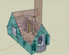
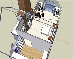
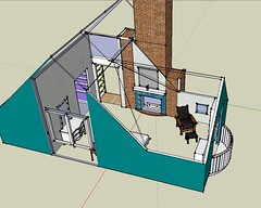
I'm so glad I did it because the roof shape from inside looks nothing like what I'd expected from seeing the 2D drawings. I'd been thinking that the bedroom would feel cavernous and the angles would be too sharp, but seeing it now I really really like it.
The only thing I don't like in this section is the dressing room, because it feels more like a walk-in closet rather than a room. It's also too small. I've already altered it slightly, by taking off the lowered ceiling that Eric had drawn in which helps a little but it's still not ideal.
I'm so glad I did it because the roof shape from inside looks nothing like what I'd expected from seeing the 2D drawings. I'd been thinking that the bedroom would feel cavernous and the angles would be too sharp, but seeing it now I really really like it.
The only thing I don't like in this section is the dressing room, because it feels more like a walk-in closet rather than a room. It's also too small. I've already altered it slightly, by taking off the lowered ceiling that Eric had drawn in which helps a little but it's still not ideal.
Monday, April 17, 2006
latest design iteration for new house
We got an email from Eric forewarning us of their arrival, and they were waiting for us when we got back. Tonight I'm going to try and look through them properly, but thought I'd begin by getting them scanned in and posted here.
First, here's Eric's comments on what he did in this iteration:
"I ended up having a blissful solid week with almost no
distractions, so I made a lot of progress with the designs.
I've done all the main drawings like floor plans, ceiling
plans, cross sections and elevations on AutoCAD, so they are
all very accurate. I worked up all of the drawing together
so that details like ceiling height and window placements
all correspond very well. I have also shown things like the
sideboard, the grandfather clock, and the big lantern, so
there should be enough detail to have useful discussions.
I have made small adjustments to quite a few little things to make
them work better (in my opinion...)
Some aspects like what happens around the fireplaces (and TV?) will
need some more thought. I played around with kitchen, and had an idea
about the main table going against the north windows. I'll look
forward to your thoughts.
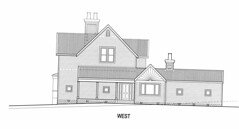
And now, here's the plans, starting with the elevation views, to which there's been little change:
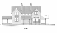
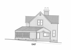
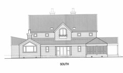
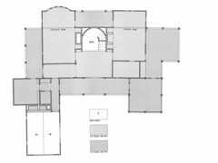
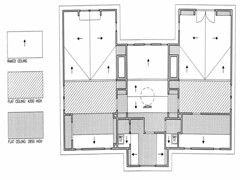
Now here's the ground floor room layout, along with a plan showing Eric's proposed ceiling heights in each area:
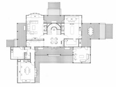
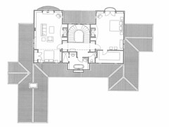
Here's the same for the second floor:
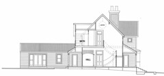
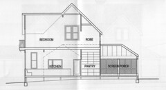
And finally, here are two cross-sections of the building which give a better feeling for how the rooms might feel:
First, here's Eric's comments on what he did in this iteration:
"I ended up having a blissful solid week with almost no
distractions, so I made a lot of progress with the designs.
I've done all the main drawings like floor plans, ceiling
plans, cross sections and elevations on AutoCAD, so they are
all very accurate. I worked up all of the drawing together
so that details like ceiling height and window placements
all correspond very well. I have also shown things like the
sideboard, the grandfather clock, and the big lantern, so
there should be enough detail to have useful discussions.
I have made small adjustments to quite a few little things to make
them work better (in my opinion...)
Some aspects like what happens around the fireplaces (and TV?) will
need some more thought. I played around with kitchen, and had an idea
about the main table going against the north windows. I'll look
forward to your thoughts.
And now, here's the plans, starting with the elevation views, to which there's been little change:
Now here's the ground floor room layout, along with a plan showing Eric's proposed ceiling heights in each area:
Here's the same for the second floor:
And finally, here are two cross-sections of the building which give a better feeling for how the rooms might feel:
Friday, March 31, 2006
thoughts on staircase
We're about to get new drawings from Eric. One of the main things he's been working on in this iteration (besides the mudroom saga!) is the staircase.
Email from Eric (March 31)
I just had a good couple of days working on detailed drawings. It was fun to get back into it. One of the main things I've been working on is the staircase. It's a pretty major design feature, and I needed to get it to work with building codes as well as be an appealing place to walk up and down. Anyway, I'll have some drawings ready to send to you early next week.
My reply (March 31)
In case it helps any, some specific thoughts on the staircase (sorry if have mentioned them already, I have lost track!) are:
- Idea of the bottom few steps being suitable for sitting on, ie: doubling as seats as well as steps. As per pattern language: "Flare out the bottom of the stair with open windows or balustrades and with wide steps so that the people coming down the stair become part of the action in the room while they are on the stair, and so that people below will naturally use the stair for seats"
- Idea of there being a landing area midway up, as a place you could pause, look down on the action, perhaps a chair in corner, low bookshelves, etc. ie: the landing area would be wider than the stairs.
- I have a vision of the stairs being wide enough for 2 people to walk up side by side without it being cramped. Like the nice stairs you find in old manors (but not ridiculously oversized like in palaces).
- would love love love to use the old oak wooden bannister railings and scrolled ends here(not necessarily the iron/copper bits though)
Email from Eric (March 31)
I just had a good couple of days working on detailed drawings. It was fun to get back into it. One of the main things I've been working on is the staircase. It's a pretty major design feature, and I needed to get it to work with building codes as well as be an appealing place to walk up and down. Anyway, I'll have some drawings ready to send to you early next week.
My reply (March 31)
In case it helps any, some specific thoughts on the staircase (sorry if have mentioned them already, I have lost track!) are:
- Idea of the bottom few steps being suitable for sitting on, ie: doubling as seats as well as steps. As per pattern language: "Flare out the bottom of the stair with open windows or balustrades and with wide steps so that the people coming down the stair become part of the action in the room while they are on the stair, and so that people below will naturally use the stair for seats"
- Idea of there being a landing area midway up, as a place you could pause, look down on the action, perhaps a chair in corner, low bookshelves, etc. ie: the landing area would be wider than the stairs.
- I have a vision of the stairs being wide enough for 2 people to walk up side by side without it being cramped. Like the nice stairs you find in old manors (but not ridiculously oversized like in palaces).
- would love love love to use the old oak wooden bannister railings and scrolled ends here(not necessarily the iron/copper bits though)
Thursday, March 30, 2006
revisiting the mudroom
Back in February, Eric came up with yet another alternative for the mudroom shape to address my previous concerns. It took me until the end of March to comment on it properly! Here's a catchup on the email discussion:
Email from Eric (Feb 15)
Here's another idea for the mud room. It involves going ahead and letting it project out as sort of a bay window next to the main entry. If we liked the idea in principle, the actual shape could be refined and developed. What do you think?
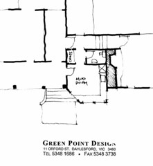

My comments (Mar 29)
Overall I really like the concept, and it's a hell of a lot better than
messing with the pantry position etc. (although at some stage I still want to get a better feel for the kitchen layout, but that's separate). In no particular order, these are my comments:
I don't like how the mudroom isn't symmetrical anymore, it has the corner cut off one side. I would rather make it a square wall without the diagonal bit.
Where you have marked as Coats in the new bit, I'd like instead to call it a cupboard... like you had in the original version way back when. Maybe it will be for coats, but more likely will end up being for all that cleaning stuff - shoe polish, brooms, blah blah blah that feels like it should belong in / near the mudroom. Maybe there will be space in the waist height units in mudroom proper but who knows. I'm envisaging instead that there will be hooks for coats in the entrance hall bit along the mudroom wall, and we could also have hooks on the wall in mudroom for messier things, behind the door.
I liked the stairs a lot in your first version coming up onto the verandah with matching curved handrails on either side. I don't like there being handrail only on one side and that it is curved if the other side is straight... Ideally I'd like to be able to have both sides curved, but that's not possible unless it moves over so it's not opposite the door (which would I think feel odd) OR perhaps the verandah base could extend out further? So that it comes out to be level with how far the new bay bit juts out? Now, I know that might mess up the amount of sunlight going in on that side? If so, perhaps could have the base of the verandah jutting out but the roof staying back? We could for instance then use the bit that isn't undercover as being for plants in pots... (cacti etc?) Not sure how it would look but it's an idea to throw out there.
Now, onto the Projection view...
One of the things I liked most in the first version was how you had the sequence of 5 small square windows on this side... I would like to get back to that. Perhaps we could just have one square window in the middle of the mudroom bay of the same shape as the others to get it back? We could still have windows on either side of the bay to let more light in but without spoiling the symmetry?
I really like the way you have moved the triangular bit (gable?) on the roof over to be above the bay area rather than above the entrance door. I like this better than the way it was originally even because it is more symmetrical. I also like how it is shingles (I loved the sunburst motif thing too but we still have that about the breakfast area side, so happy to have something different).
Email from Eric (Feb 15)
Here's another idea for the mud room. It involves going ahead and letting it project out as sort of a bay window next to the main entry. If we liked the idea in principle, the actual shape could be refined and developed. What do you think?
My comments (Mar 29)
Overall I really like the concept, and it's a hell of a lot better than
messing with the pantry position etc. (although at some stage I still want to get a better feel for the kitchen layout, but that's separate). In no particular order, these are my comments:
I don't like how the mudroom isn't symmetrical anymore, it has the corner cut off one side. I would rather make it a square wall without the diagonal bit.
Where you have marked as Coats in the new bit, I'd like instead to call it a cupboard... like you had in the original version way back when. Maybe it will be for coats, but more likely will end up being for all that cleaning stuff - shoe polish, brooms, blah blah blah that feels like it should belong in / near the mudroom. Maybe there will be space in the waist height units in mudroom proper but who knows. I'm envisaging instead that there will be hooks for coats in the entrance hall bit along the mudroom wall, and we could also have hooks on the wall in mudroom for messier things, behind the door.
I liked the stairs a lot in your first version coming up onto the verandah with matching curved handrails on either side. I don't like there being handrail only on one side and that it is curved if the other side is straight... Ideally I'd like to be able to have both sides curved, but that's not possible unless it moves over so it's not opposite the door (which would I think feel odd) OR perhaps the verandah base could extend out further? So that it comes out to be level with how far the new bay bit juts out? Now, I know that might mess up the amount of sunlight going in on that side? If so, perhaps could have the base of the verandah jutting out but the roof staying back? We could for instance then use the bit that isn't undercover as being for plants in pots... (cacti etc?) Not sure how it would look but it's an idea to throw out there.
Now, onto the Projection view...
One of the things I liked most in the first version was how you had the sequence of 5 small square windows on this side... I would like to get back to that. Perhaps we could just have one square window in the middle of the mudroom bay of the same shape as the others to get it back? We could still have windows on either side of the bay to let more light in but without spoiling the symmetry?
I really like the way you have moved the triangular bit (gable?) on the roof over to be above the bay area rather than above the entrance door. I like this better than the way it was originally even because it is more symmetrical. I also like how it is shingles (I loved the sunburst motif thing too but we still have that about the breakfast area side, so happy to have something different).
Saturday, February 11, 2006
a wacky rethink of downstairs
We are struggling to get the placement of the downstairs bathroom right.
It started out opening off the central hall, but that was too prominent and we didn't want it opening directly from a place that would be doubling as a dining room. Dave also suggested it should be near a side of the house so it's easy to access from the garden.
So then it moved to take up some of the space in the mudroom. Except that there isn't enough space there so every iteration we've tried so far just makes it feel awfully cramped.
An idea just occurred to me, sparked by discussing the Pattern Language insights with Dave, which might help - except it requires rather greater rearrangement of the downstairs.
What if we put the mudroom back the way it was to begin with, that we all loved.
What if we made the stair landing, midway up, wider ... space for an armchair in the corner, some books, if you ever had a party with musicians you could even stick them up there like an mini stage! OK, I'm getting carried away, but if the landing had a larger floor area it'd give us much more flexibility.
Then, what if we moved the pantry, so that instead of it being on the side of the kitchen facing the secret garden, it was behind the front porch in the room 'under the stairs'... which is now much more spacious than a hallway sized cupboard because the landing is wider. We'd still have our "living hall" downstairs, it's just not quite so ginormous...but still plenty enough space for Xmas trees and dinner parties.
(We'd have to move the chimney I guess? And if so, the upstairs bedroom would need tweaking because of the new chimney location, but other than that hopefully it wouldn't mess up the structural stuff too much).
Then, that gives us space at the back of the house that was formerly the pantry to play with and squeeze the bathroom. I don't know what this looks like exactly, but maybe something like this:

Although not exactly this, because Dave doesn't like it. He likes the new position of the pantry, but he doesn't like something to do with the verandah and sunroom. I can't work out what exactly though. Something about not being able to walk to the breakfast area to the sunroom, except that you can - although maybe it's because he wants it to be under a verandah? I'm not sure. If that's the case then all we have to do is extend the sunroom & breakfast room verandah areas out a bit more and voila the undercover walkway is back again. But I suggested that and he just frowned. So I don't know *sigh*
It's an idea anyway.
It started out opening off the central hall, but that was too prominent and we didn't want it opening directly from a place that would be doubling as a dining room. Dave also suggested it should be near a side of the house so it's easy to access from the garden.
So then it moved to take up some of the space in the mudroom. Except that there isn't enough space there so every iteration we've tried so far just makes it feel awfully cramped.
An idea just occurred to me, sparked by discussing the Pattern Language insights with Dave, which might help - except it requires rather greater rearrangement of the downstairs.
What if we put the mudroom back the way it was to begin with, that we all loved.
What if we made the stair landing, midway up, wider ... space for an armchair in the corner, some books, if you ever had a party with musicians you could even stick them up there like an mini stage! OK, I'm getting carried away, but if the landing had a larger floor area it'd give us much more flexibility.
Then, what if we moved the pantry, so that instead of it being on the side of the kitchen facing the secret garden, it was behind the front porch in the room 'under the stairs'... which is now much more spacious than a hallway sized cupboard because the landing is wider. We'd still have our "living hall" downstairs, it's just not quite so ginormous...but still plenty enough space for Xmas trees and dinner parties.
(We'd have to move the chimney I guess? And if so, the upstairs bedroom would need tweaking because of the new chimney location, but other than that hopefully it wouldn't mess up the structural stuff too much).
Then, that gives us space at the back of the house that was formerly the pantry to play with and squeeze the bathroom. I don't know what this looks like exactly, but maybe something like this:
Although not exactly this, because Dave doesn't like it. He likes the new position of the pantry, but he doesn't like something to do with the verandah and sunroom. I can't work out what exactly though. Something about not being able to walk to the breakfast area to the sunroom, except that you can - although maybe it's because he wants it to be under a verandah? I'm not sure. If that's the case then all we have to do is extend the sunroom & breakfast room verandah areas out a bit more and voila the undercover walkway is back again. But I suggested that and he just frowned. So I don't know *sigh*
It's an idea anyway.
new mudroom layout (still WIP)
A few days ago we got an email from Eric, with a sketch of a new idea for the mudroom incorporating the downstairs loo:
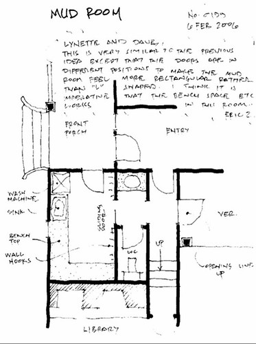
This works better than the previous one because the loo area feels more self-contained. But unfortunately it still doesn't feel right.
I know we'll be using this loo a lot, and that visitors will too. I don't want the toilet area itself to feel like a cubicle in a corridor, not so cramped. I also know that the mudroom will become a dumping ground for 'mess' from Dave and for all that stuff that you have to put away but just can't face doing at that moment. This means the mudroom will live up to its messy name a lot of the time... but I don't want the mess visible every time you go to the loo! The sliding door will help but it also has the effect of making it feel very enclosed, and so I know most of the time we'll end up leaving the door open.
I'm wondering whether the solution is just to bite the bullet and accept that we need a bigger space in this wing. What if we moved over the 'secret garden' verandah by the width of the passage? Or, What if we stretched out that entire side of the house, getting extra space in the lounge as well as the library wing? Perhaps then we could even keep the same floor area in the library by nudging the boundary of the mudroom wall back a bit, thus getting us even more space for the mudroom/bathroom bit? That way maybe we could get that glorious cupboard back with space for all the cleaning junk, and get back to the lovely feel that it had before we started trying to squeeze in the loo.
I feel I'm being awfully fussy but I don't want to forever kick myself when I live there for not fixing it.
This works better than the previous one because the loo area feels more self-contained. But unfortunately it still doesn't feel right.
I know we'll be using this loo a lot, and that visitors will too. I don't want the toilet area itself to feel like a cubicle in a corridor, not so cramped. I also know that the mudroom will become a dumping ground for 'mess' from Dave and for all that stuff that you have to put away but just can't face doing at that moment. This means the mudroom will live up to its messy name a lot of the time... but I don't want the mess visible every time you go to the loo! The sliding door will help but it also has the effect of making it feel very enclosed, and so I know most of the time we'll end up leaving the door open.
I'm wondering whether the solution is just to bite the bullet and accept that we need a bigger space in this wing. What if we moved over the 'secret garden' verandah by the width of the passage? Or, What if we stretched out that entire side of the house, getting extra space in the lounge as well as the library wing? Perhaps then we could even keep the same floor area in the library by nudging the boundary of the mudroom wall back a bit, thus getting us even more space for the mudroom/bathroom bit? That way maybe we could get that glorious cupboard back with space for all the cleaning junk, and get back to the lovely feel that it had before we started trying to squeeze in the loo.
I feel I'm being awfully fussy but I don't want to forever kick myself when I live there for not fixing it.
Subscribe to:
Posts (Atom)